HANDSHAKE
befores & afters
big changes with little context
Because this is the best part anyway.
Handshake is a 3-sided marketplace between students, schools, and employers with one objective: get careers started, and get students hired. Which means in 3.5+ years of working here, I’ve had the privilege to work on a lot of cool stuff: B2C, B2B, desktop, mobile, fun Gen Z-focused consumery stuff, very enterprisey tooling stuff, emails, notifications, super complex redesigns, thousands of tiny wins, and touching almost every surface area in the student product. Here’s a sampling of transformations that have made the lives of our users easier, and huge impacts on the business.
students
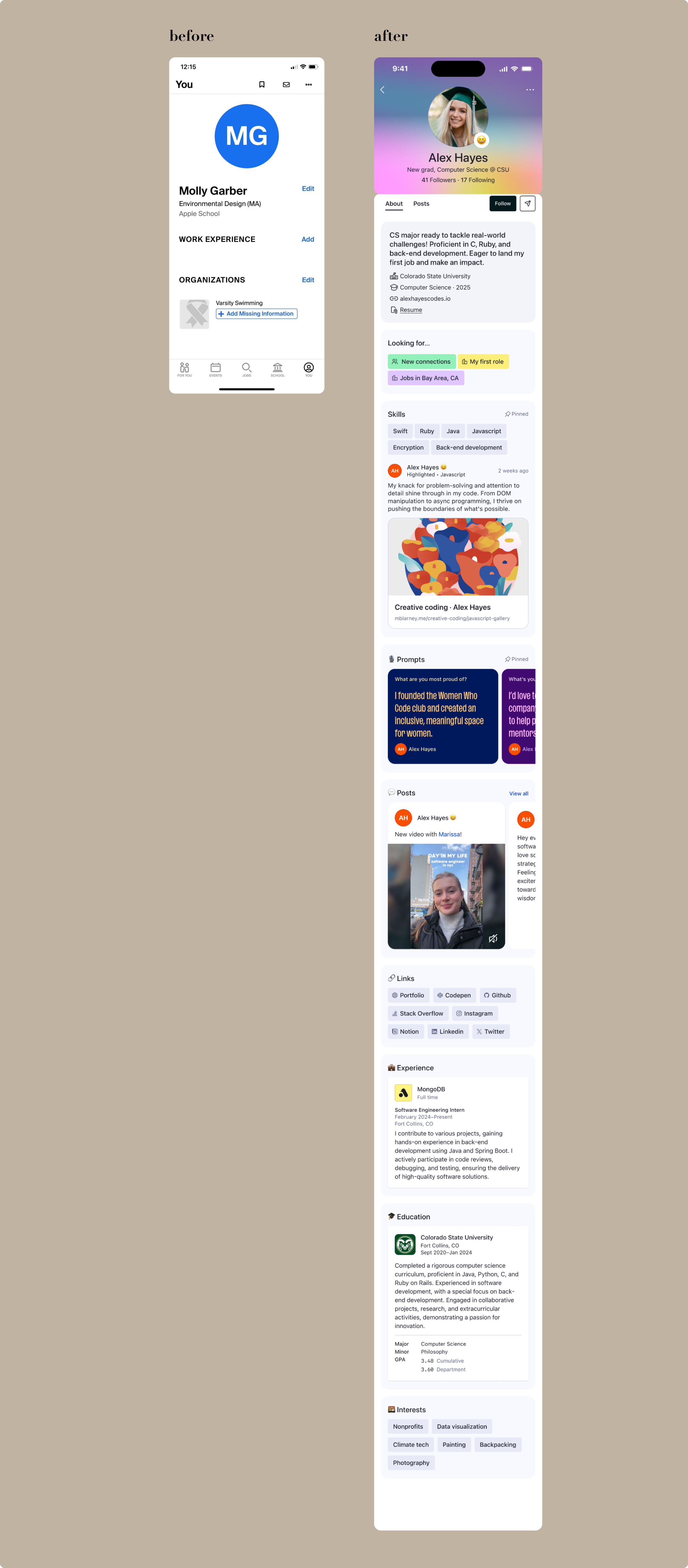
profile vision
A vision project I co-led with another staff designer, and probably my favorite project so far at Handshake. We facilitated an in-person sprint, conducted 2 rounds of research, and interfaced with top execs a bunch. Our goals / mandates were to upgrade the student profile to be: Gen-Z friendly (aka way more fun), more customizable, a good balance of professional and personal, consumer-ready (meaning anyone, not just students, can use and get value out of it), standardized for employers to use for evaluation, puts students in a great light (even if they don’t have work experience yet), mobile-first, wouldn’t take a year to build but isn’t just a reskin, highlights user-generated content, provides students with everything they need for their digital professional identity, and makes them excited to fill it out and keep it updated for daily active user (DAU) purposes.
Piece of cake. 🫠
mobile
desktop
student
homepage redesign
Look, our old homepage was just bad. According to the data, it got almost no engagement despite being a mile long with every conceivable collection of jobs you could come up with. It was a place you landed—maybe you clicked on your career center link, or the messaging CTA at the top—and quickly left. And it hadn’t been updated in years. The next version needed to include user-generated content from our feed, be dynamic and personalized for each student, and provide entry points for other features (career center page and collections, events, employer pages, etc.) We’re now testing and iterating on this page constantly, because engagement is up (+1.82% DAU, +1.6% job applications, 2.53% job views, +3.29% job views) and it’s clearly providing value for students.
student
onboarding reskin
Onboarding was a legacy part of the app that hadn’t been updated since its creation. It’d been added to—ticking up the page count to 23—but hadn’t been holistically looked at basically ever. Unfortunately, at time of this project, and given the complexity of registration and data mapping of this flow, the most that could get prioritized was a reskin. We updated the UI to be current with our design system, and I gave the copy on each page a rewrite. Even though I desperately wanted to give it the simplification and overhaul it needed, I stuck with making the tone warm, welcoming, and succinct.
Spoilers: As of this writing in March of 2025, I’m now leading the initiative to recreate onboarding from scratch and I couldn’t be happier.
employer
messaging tool redesign
With Handshake, employers have the ability to target and message up to 3,000 students at once. They’re called campaigns and it’s the feature that brings in the most money for the company. It’s pretty neat and a differentiator from our competitors, but the creation process was old and outdated and unnecessarily complex. Especially the part where you had to create the audience for your campaign in a completely part of the product. We revamped the creation flow with simpler steps, better content strategy (hierarchy, ordering, and guidance), and put audience creation in the flow seamlessly too.
employer
another onboarding redesign
this onboarding is for a very specific type of user on our employer product—an advocate. without spending 1,000 words explaining how advocates fit into our business, let’s just say they’re non-recruiting employees that recruiters bring onto the platform to help nurture interested students by answering questions recruiters can’t answer.
problem was, they weren’t properly onboarded to our product. in fact, they went through a recruiter’s onboarding flow, which was wrong and confusing. with this project, advocates got their own onboarding flow, to better set expectations and communicate how they can help students.


